Search Results for: Photo

One thing that always surprises me is that the Mid Hudson library system has no books on Geographical Information Systems

One thing that always surprises me is that the Mid Hudson library system has no books on Geographical Information Systems. πŸ“š 

Seems so odd with GIS being such a big topic these days and powerful GIS software like QGIS widely available – with mapping, GPS and aerial photography such a big part of our lives today. YouTube, free web classes and internet documentation is great but it sure would be nice if they had books that one could read about at the library. 

Fun NY Geographic Facts

The Town of Greenville is 39 sq miles, the Bourgh of Manhattan is 33 sq miles. A few more cows in Greenville though then Manhattan.

Staten Island about the size of Altona in Clinton County at 101 square miles. A few less wind turbines in Staten Island, and far less hot air.

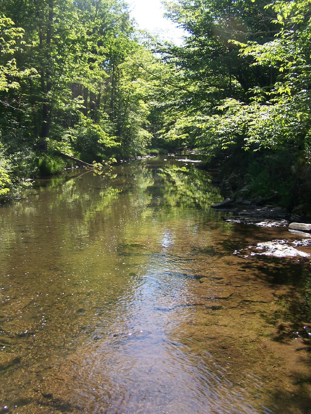
Swimming Hole

All of New York City would fit into the area of Town of Long Lake, Webb, or Brookhaven.

The Town of Westerlo is approximately the same size as the Borough of Bronx at 58 square miles. Yes, but do they have Dick Rapp as their town supervisor?

The biggest town area-wise in New York State is Brookhaven on Long Island at 532 sq miles. Town of Webb (Old Forge) has 483 sq miles.

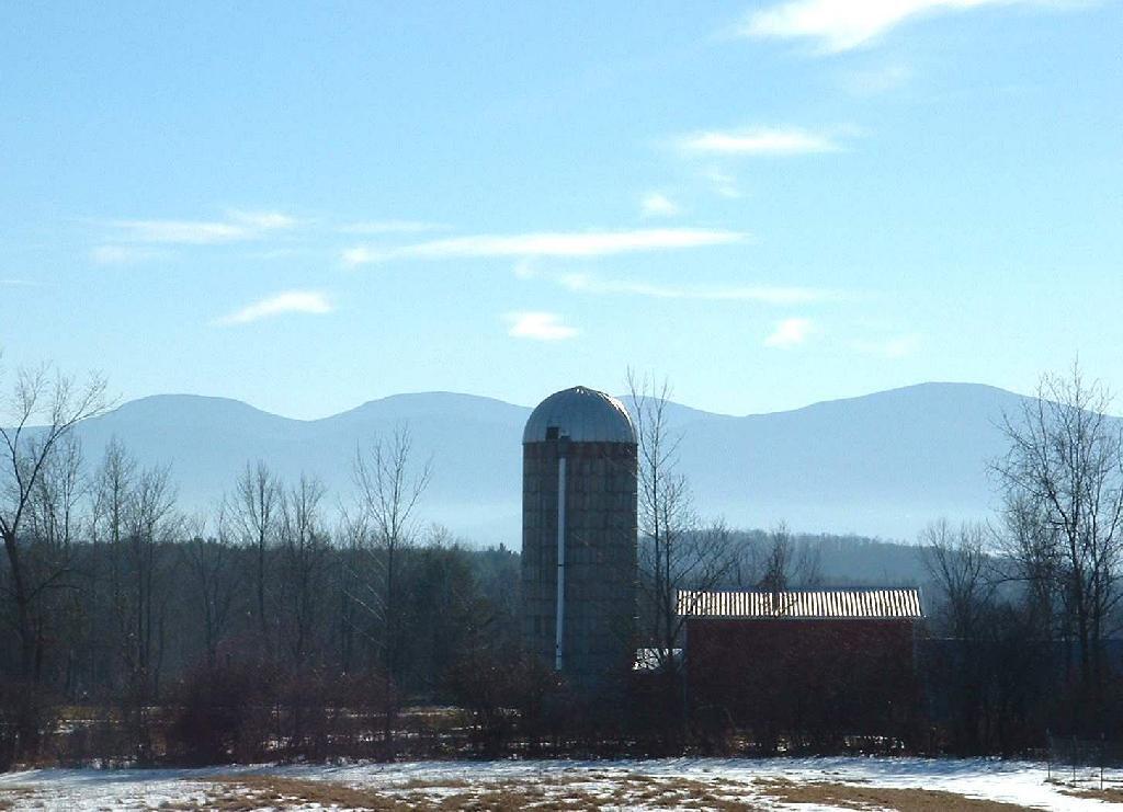
Barn Silloute Against TriMount

The difference between the year-round population of the Town of Webb and Town of Brookhaven is about the population of Albany County at 295,000 persons.

Yonkers is about the same size as Albany, NY at 21 square miles.

The typical town in Western NY is 36 square miles and is a nice square shape. Not all though as geography sometimes over rides that nice square shape.

Walk on By

The largest town in Western NY is Bath, NY at 101 square miles, or about the size of Staten Island.

Owego, near Binghamton is the largest Central New York town at 101 square miles. It should not be confused with Oswego which is near Syracuse.

I’ve been looking through my Leaflet mapping code, and realized the system by default lists over 100 layers

I’ve been looking through my Leaflet mapping code, and realized the system by default lists over 100 layers. That’s probably too much and the way the code is written in an incremental piece-by-piece fashion, it’s really hard to maintain. So I am working on converting it over a flat-file CSV spreadsheet, then I can just iterate through that and pull the layers I actually need or think would be useful for a map. Also, I want more flexibility on base layers vs overlays — often there are layers I would like to add in a dual pane mode, but can’t do under the current design of code, such as National Land Cover vs Aerial Photo or NLCD 2001 vs 2016 to better track land use changes.

Remote Sensing, Satellite Images, Satellite Imagery

How to Interpret a False-Color Satellite Image – Earth Imaging Journal: Remote Sensing, Satellite Images, Satellite Imagery

In our photo-saturated world, it’s natural to think of the images on NASA’s Earth Observatory website as snapshots from space. But most aren’t. Though they may look similar, photographs and satellite images are fundamentally different. A photograph is made when light is focused and captured on a light-sensitive surface such as film or a charge-coupled device in a digital camera. A satellite image is created by combining measurements of the intensity of certain wavelengths of light that are visible and invisible to human eyes.

Why does the difference matter? When we see a photo where the colors are brightened or altered, we think of it as artful (at best) or manipulated (at worst). We also have that bias when we look at satellite images that don’t represent the Earth’s surface as we see it. “That forest is red,” we think, “so the image can’t possibly be real.”

In reality, a red forest is just as real as a dark green one. Because satellites collect information beyond what human eyes can see, images made from other wavelengths of light look unnatural to us. We call these false-color images. To understand what they mean, it’s necessary to understand exactly what a satellite image is.

I continue to look with much interest in the oft-advertised Northwoods Mapping on Facebook

I continue to look with much interest in the oft-advertised Northwoods Mapping on Facebook. This business makes custom farm, hunting, and property maps, printed and sells them over the internet. All of them pretty much use public, copyright-free data, namely state or federal (NAIP) orthophoto aerial imagery, and USGS 3D elevation program LIDAR bare earth data. I don’t know if they use a commercial ERSI product or the fully-open source QGIS program to make the maps, but there is nothing couldn’t be done with free software.

Their prices are quite reasonable – they might seem high at first glance – but it would actually be hard to undercut if you want to make any money for your time designing, laying out and printing maps. Large-format, full-color printing is expensive for small runs. I know I have printed a few large-scale maps, and the printing can easily set you back $50 or more. Add in the cost of high-quality paper and lamination and it really adds up. For example, the 24″ x 36″ HD Laminated Map that they charge $89 for probably nearly half the cost is printing and lamination. Maybe a little less, especially if you do a lot of business with your printer — but custom print jobs are expensive.

So that leaves you with $45 for everything else. As a small business, there are a lot of costs including taxes, marketing, web hosting, and possibly trying to recover some of your cost of using the computer, internet, and so forth. That ignores benefits or other expenses – they probably rely on a regular job for that. Then figure an hour of labor, and you can figure out the cost. Yes, it’s a job you can do from home, and basically anywhere you have an internet connection. But hardly free, despite the data and software free to use and put together.

It doesn’t take long to make a map with QGIS, especially with using Web Mapping Services, that automatically download the imagery for the scene you need into your QGIS client. But no one map is exactly the same, and while you can save the layout, often it requires fine tweaking to get a quality map out of every scene. Labels often require manual placement, the contrast and saturation of map adjusted for that perfect look. Adjustments to scale, additional data to hand-digitize. Plus time going back and forth with the customer to get them a product they are happy with before it goes to print shop. Probably an hour or more time, to get something that is really good quality, that somebody would pay for. It takes years of knowledge working with maps to build really good quality products.

The more time you can spend working on a map, the higher quality. Often revisions take a lot of time — sometimes the maps I post on the blog aren’t always the best quality, but that’s because they are done quickly and to experiment with new parts of QGIS. But it’s neat that they’re able to make a life in the great wilds of northern Minnesota, in a beautiful small town, the home of the Blue Ox, piecing together map making over the internet, and whatever else they do to sustain their family.

While I have done a handful of mapping projects for pay, I don’t really have a connection with a print shop. Most of my projects are done an as volunteer basis, continuing to learning the ins and outs of the software. Every map I put together is teaching me important skills, and I continue to learn the skills to make better and prettier maps. But I think it’s an interesting business opportunity, and if I learned more about print shops and shipping, along with all the other skills needed to operate a small business, it could offer future possibilities. People have certainly asked if I could provide them with that kind of printed map before — but I just don’t have that kind of connection with a local print or shipping shop.
How to Add LIDAR Hillshade to Your LeafletJS Map

How to Add LIDAR Hillshade to Your LeafletJS Maps

Using the 3DEP Hillshade and some CSS3, it’s quite easy to add beautiful, LIDAR-generated hillshade to LeafletJS Maps.

A few things to note …

  • This is not mobile friendly, as it uses a lot of CPU for the mix-blend-mode, so you may want to disable for mobile browsers
  • Areas without hillshade (e.g. the ocean) are shown as black, so you won’t want to use this for large scale maps

Here is a simple example of how to do this with NY Aerial Orthophotography:

<html>
  <head>
    <title>Example</title>
    <meta name="viewport" content="initial-scale=1.0, user-scalable=no">
    <meta charset="utf-8">
    <style>
      html, body, #map-canvas {
        height: 100%;
        margin: 0px;
        padding: 0px;
      }
     
     .lidarBase {
		 filter: brightness(140%) contrast(100%) !important; 
		 // this filter raises brightness and contrast for better appearance
	 }
      
    .baseLayer  {
		mix-blend-mode: multiply !important;
		// usually a nice way to blend the hillshade with the overlay
	}
	
	.nyAerial {
		filter: saturate(150%) contrast(110%) brightness(130%);
		// enhance colors a bit
	}
    </style>

    <link rel="stylesheet" href="https://unpkg.com/leaflet@1.6.0/dist/leaflet.css">
    <script src="https://unpkg.com/leaflet@1.6.0/dist/leaflet.js"></script>

  </head>
  <body>	  
    <div id="map-canvas"></div>
          <script>
          
var nyAerial =	L.tileLayer.wms(
	'https://orthos.its.ny.gov/ArcGIS/services/wms/Latest/MapServer/WMSServer?', 
	{ layers: '0,1,2,3,4,5', 
	attribution: 'NYS High-Resolution Color Aerial (Winter 2015-2020) - <a href="https://gis.ny.gov/">NYS Geographic Information Services</a>', 
	className: 'nyAerial',
	maxZoom: 21 });

var lidarBase =	L.tileLayer.wms(
	'https://elevation.nationalmap.gov/arcgis/services/3DEPElevation/ImageServer/WMSServer?', 
	{ 
		layers: '3DEPElevation:Hillshade Gray',
		className: 'lidarBase',
	}
);

var map = L.map('map-canvas', {
			center: [42.37348470, -76.88088670],
			zoom: 17,
			layers: [lidarBase,nyAerial]
		});
		
</script>
</body>
</html>

Here is the produced map with this code: