Here is a list of the ten most Hispanic counties in New York State from the 2020 US Census

Here is a list of the ten most Hispanic counties in New York State from the 2020 US Census.

CountyPercent Hispanic
Bronx54.7625579396111
Queens27.7643315385306
Westchester26.8138904900857
New York23.7650737700612
Orange22.3627619545987
Suffolk21.8202133794694
Rockland19.6409412140254
Richmond19.5583634394157
Kings18.8747087980808
Nassau18.3715271956635

Here is how you can create this list using PANDAS. You will need to get the PL-94 171 Redistricting data, the Legacy File Format Header Records, and expand the ZIP file and place in the appropriate directory described below.

import pandas as pd
import geopandas as gpd

# path where 2020_PLSummaryFile_FieldNames.xlsx XX=State Code
# and XXgeo2020.pl, xx000012020.pl through XX000032020.pl
# reside on your hard drive
path='/home/andy/Desktop/2020pl-94-171/'

# state code
state='ny'

# header file, open with all tabs as an dictionary of dataframes
field_names=pd.read_excel(path+'2020_PLSummaryFile_FieldNames.xlsx', sheet_name=None)

# load the geoheader, force as str type to mixed types on certain fields
# ensure GEOIDs are properly processed avoids issues with paging
gh=pd.read_csv( path+state+'geo2020.pl',delimiter='|',
               header=None, 
               names=field_names['2020 P.L. Geoheader Fields'].columns,
               index_col='LOGRECNO',
               dtype=str )
               
 # load segment 1 of 2020 PL 94-171 which is racial data 
segNum=1
seg=pd.read_csv( path+state+'0000'+str(segNum)+'2020.pl',delimiter='|',
               header=None, 
               names=field_names['2020 P.L. Segment '+str(segNum)+' Fields'].columns,
               index_col='LOGRECNO',
              )
# discard FILEID, STUSAB, CHARITER, CIFSN as duplicative after join
seg=seg.iloc[:,4:]

# join seg to geoheader
seg=gh.join(seg)

# Calculate the population of New York Counties that is African American 
# using County SUMLEVEL == 50 (see Census Docts)
ql="SUMLEV=='050'"

# Create a DataFrame with the County and Percent Hispani
# You can get the fields list from 2020 PL Summary FieldNames.xlsx
# under the 2020 P.L. Segment 1 Definitions tab
his=pd.DataFrame({ 'County': seg.query(ql)['BASENAME'], 
              'Percent Hispanic': seg.query(ql)['P0020002'] / seg.query(ql)['P0020001'] *100})

# Sort and print most Hispanic Counties
his.sort_values(by="Percent Hispanic", ascending=False).head(10).to_csv('/tmp/hispanics.csv')
SVGZ Graphic:  Real Median Household Income, 1984-2020
SVGZ Graphic: 2020 Center of Population
SVGZ Graphic: 2020 Mississippi Household Income
SVGZ Graphic: 2020 Mississippi Population
SVGZ Graphic: 2020 State Population
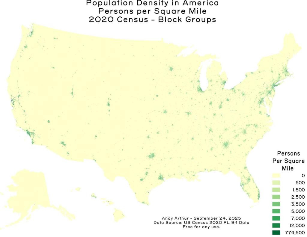
SVGZ Graphic: 2020 State Population Density
SVGZ Graphic: 2020 US Population by Census Region
SVGZ Graphic: 25 Counties with the Fewest College Graduates (Bachelors or Post-Graduate)
SVGZ Graphic: 25 Most Densely Populated Municipalites and CCDs in America
SVGZ Graphic: 25 Poorest Counties in America
SVGZ Graphic: African Americans - Percent of County Population
SVGZ Graphic: Area of US Counties
SVGZ Graphic: Classifying Similiar States for Income Distribution
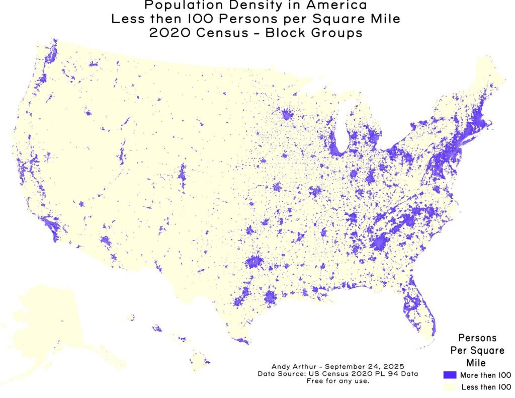
SVGZ Graphic: Counties with fewer then 100 people per sq mile
SVGZ Graphic: Domestic Migration, June 2020 to 2022
SVGZ Graphic: Half of All Americans Live Within 79 MIles of the Ocean
SVGZ Graphic: Highest Population Density Counties in Each State
SVGZ Graphic: Hispanic Population in Texas
SVGZ Graphic: How Asians Voted in NYS in 2020
SVGZ Graphic: How Many People Reside in Each Time Zone
SVGZ Graphic: Kentucky - 2020 Population
SVGZ Graphic: Land Area of States
SVGZ Graphic: Median Age by State
SVGZ Graphic: Median Household Income in Michigan
SVGZ Graphic: Median Household Income, NY and Surrounding States
SVGZ Graphic: Median Income by State
SVGZ Graphic: Median Income Distribution by State
SVGZ Graphic: Median Value of Owner Occupied Homes
SVGZ Graphic: Most Similiar Income Distributions to New York
SVGZ Graphic: Most White Counties in America
SVGZ Graphic: New York State 1790 Census
SVGZ Graphic: Ohio US Senate GOP Primary
SVGZ Graphic: Percent Male - US Congressional District
SVGZ Graphic: Percent of America's Population by State
SVGZ Graphic: Percentage of Irish Residents per State
SVGZ Graphic: Percentage of the Population that Was Born In-State
SVGZ Graphic: Population Born Out of State
SVGZ Graphic: Population Change by State, 2020 to 2022
SVGZ Graphic: Population Density in Texas
SVGZ Graphic: Population of State Capital Metro Regions
SVGZ Graphic: Population Reporting Somalian Ancestry
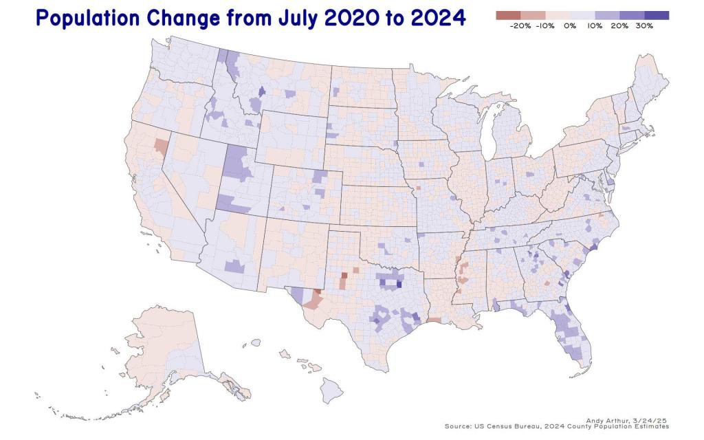
SVGZ Graphic: State Population Change, 2020-2025
SVGZ Graphic: Texas County Population
SVGZ Graphic: The Rich Men North of Richmond (Median Household Income)
SVGZ Graphic: Where New York State Residents Moved To in 2015-20
Thematic Map: 2020 County Population Dot Density
Thematic Map: Albany Population Density
Thematic Map: BOCES Districts
Thematic Map: Census Blocks With More then 100 People Per Square Mile
Thematic Map: Census Tracts in America with Fewer then 100 People Per Square Mile
Thematic Map: County Population Under 25k
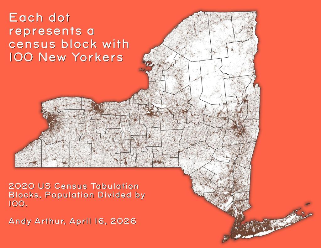
Thematic Map: Each dot represents a census block with 100 New Yorkers
Thematic Map: Households Making Less then $100,000/yr in 2023
Thematic Map: Households Making Less then $50,000 in Each State
Thematic Map: Metro Areas in New York
Thematic Map: NY Population Change 1970 to 2022
Thematic Map: Untitled
Thematic Map: US Median Household Income by Census Tract
Thematic Map: US Population Change - 2020 to 2024
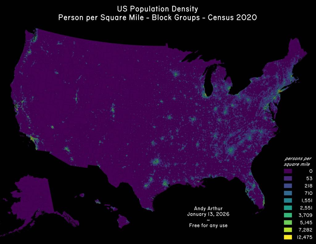
Thematic Map: US Population Density
Thematic Map: US Population Non Contiguous Cartogram
Thematic Map: us-state-pop-density-1900