Move to Minnesota for a Long Life

The median age of a man👨 in United States is 36.1 while the median age of women 👩 is 38.8 — women are nearly 3 years older on average compared to men.

This is largely due to the fact that men die earlier then women ⚰ — the median death age for men in our country is 76 years, while the median death age for women is 81 years.

The best state to live in for a long life is Minnesota 🐄 — men die there on average at 79 years, while women live until 83. In Hawaii though, women last even longer — the median life expectancy for women in Hawaii is nearly 85 years. 🏖

SVGZ Graphic:  Real Median Household Income, 1984-2020
SVGZ Graphic: 2020 Center of Population
SVGZ Graphic: 2020 Mississippi Household Income
SVGZ Graphic: 2020 Mississippi Population
SVGZ Graphic: 2020 State Population
SVGZ Graphic: 2020 State Population Density
SVGZ Graphic: 2020 US Population by Census Region
SVGZ Graphic: 25 Counties with the Fewest College Graduates (Bachelors or Post-Graduate)
SVGZ Graphic: 25 Most Densely Populated Municipalites and CCDs in America
SVGZ Graphic: 25 Poorest Counties in America
SVGZ Graphic: African Americans - Percent of County Population
SVGZ Graphic: Area of US Counties
SVGZ Graphic: Classifying Similiar States for Income Distribution
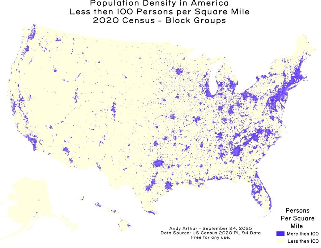
SVGZ Graphic: Counties with fewer then 100 people per sq mile
SVGZ Graphic: Domestic Migration, June 2020 to 2022
SVGZ Graphic: Half of All Americans Live Within 79 MIles of the Ocean
SVGZ Graphic: Highest Population Density Counties in Each State
SVGZ Graphic: Hispanic Population in Texas
SVGZ Graphic: How Asians Voted in NYS in 2020
SVGZ Graphic: How Many People Reside in Each Time Zone
SVGZ Graphic: Kentucky - 2020 Population
SVGZ Graphic: Land Area of States
SVGZ Graphic: Median Age by State
SVGZ Graphic: Median Household Income in Michigan
SVGZ Graphic: Median Household Income, NY and Surrounding States
SVGZ Graphic: Median Income by State
SVGZ Graphic: Median Income Distribution by State
SVGZ Graphic: Median Value of Owner Occupied Homes
SVGZ Graphic: Most Similiar Income Distributions to New York
SVGZ Graphic: Most White Counties in America
SVGZ Graphic: New York State 1790 Census
SVGZ Graphic: Ohio US Senate GOP Primary
SVGZ Graphic: Percent Male - US Congressional District
SVGZ Graphic: Percent of America's Population by State
SVGZ Graphic: Percent of Households Making Less then 20,000 in 2024 [Expires June 5 2026]
SVGZ Graphic: Percentage of Irish Residents per State
SVGZ Graphic: Percentage of the Population that Was Born In-State
SVGZ Graphic: Population Born Out of State
SVGZ Graphic: Population Change by State, 2020 to 2022
SVGZ Graphic: Population Density in Texas
SVGZ Graphic: Population of State Capital Metro Regions
SVGZ Graphic: Population Reporting Somalian Ancestry
SVGZ Graphic: State Population Change, 2020-2025
SVGZ Graphic: Texas County Population
SVGZ Graphic: The Rich Men North of Richmond (Median Household Income)
SVGZ Graphic: Where New York State Residents Moved To in 2015-20
Thematic Map: 2020 County Population Dot Density
Thematic Map: Albany Population Density
Thematic Map: BOCES Districts
Thematic Map: Census Tracts in America with Fewer then 100 People Per Square Mile
Thematic Map: County Population Under 25k
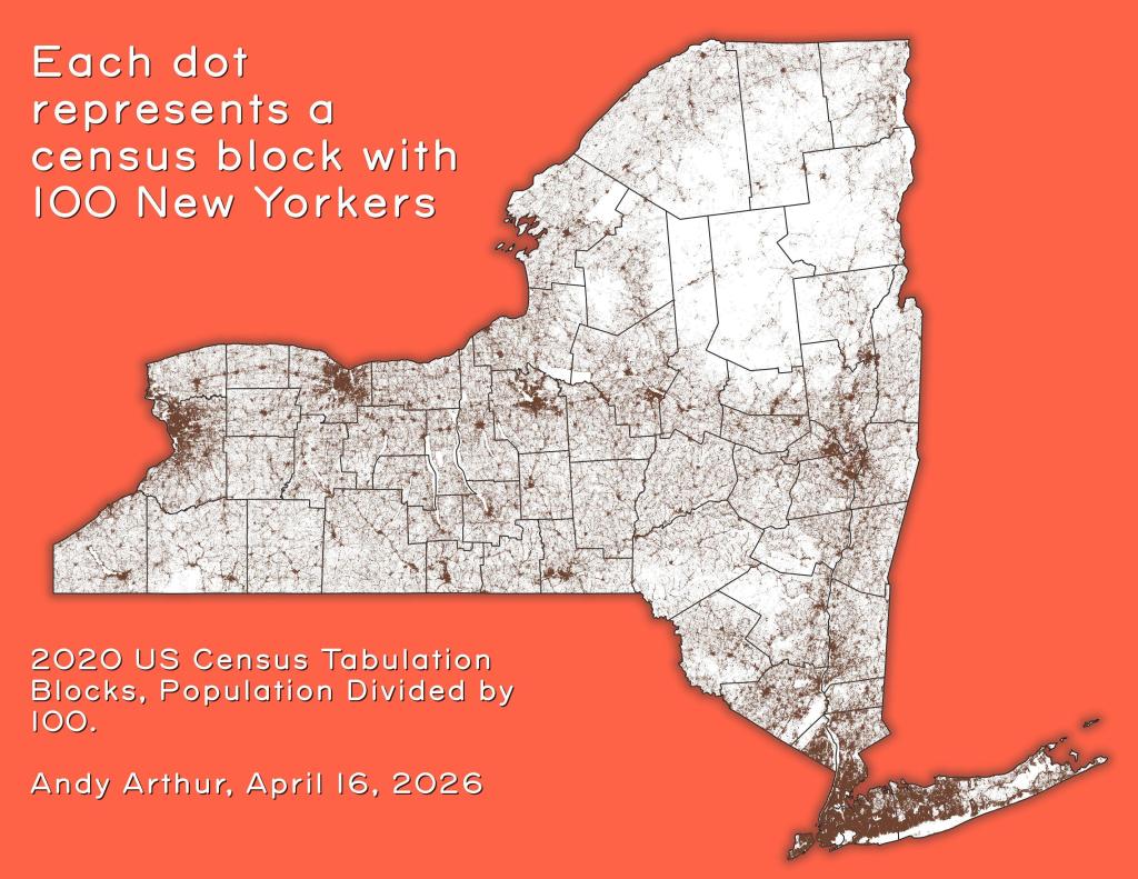
Thematic Map: Each dot represents a census block with 100 New Yorkers
Thematic Map: Households Making Less then $100,000/yr in 2023
Thematic Map: Households Making Less then $50,000 in Each State
Thematic Map: Metro Areas in New York
Thematic Map: NY Population Change 1970 to 2022
Thematic Map: Untitled
Thematic Map: US Median Household Income by Census Tract
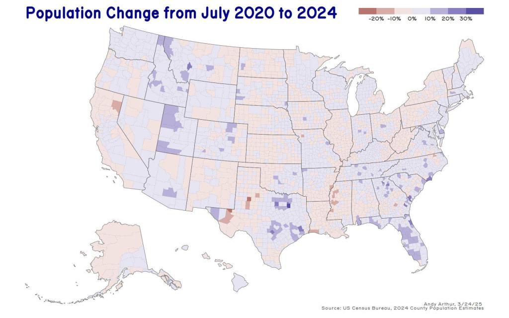
Thematic Map: US Population Change - 2020 to 2024
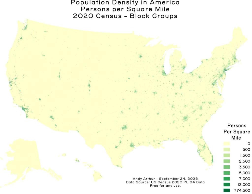
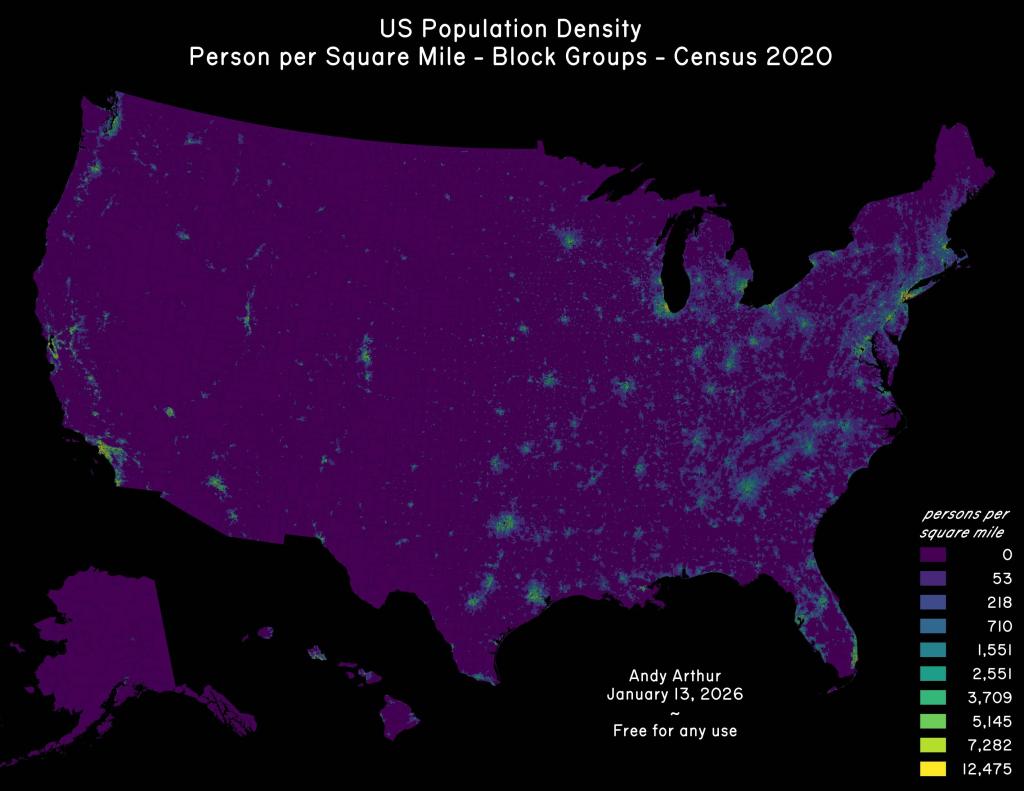
Thematic Map: US Population Density
Thematic Map: US Population Non Contiguous Cartogram
Thematic Map: us-state-pop-density-1900

Leave a Reply

Your email address will not be published. Required fields are marked *