Households That Make Less then $20k in America 💵

If Puerto Rico was a state, it would be by far the poorest in America. Significant poverty continues to exist in the south, indeed the most impoverished states are Mississippi, West Virginia, Louisiana, New Mexico and Alabama according to the 2020 American Community Survey 5 year averages.

State Households Making Under 20k
Puerto Rico 48.2
Mississippi 22.6
West Virginia 20.6
Louisiana 20.1
New Mexico 19.6
Alabama 19.3
Arkansas 18.9
Kentucky 18.8
South Carolina 17.0
Tennessee 16.6
Oklahoma 16.2
North Carolina 15.8
Ohio 15.6
Georgia 15.2
Missouri 15.2
District of Columbia 15.2
Montana 15.1
New York 15.0
Maine 15.0
Michigan 14.9
Florida 14.9
Rhode Island 14.6
Indiana 14.6
Pennsylvania 14.2
Texas 13.9
Arizona 13.7
Vermont 13.7
Illinois 13.7
Kansas 13.6
North Dakota 13.5
South Dakota 13.5
Iowa 13.4
Nevada 13.4
Idaho 13.3
Oregon 13.1
Wyoming 13.0
Wisconsin 12.9
Nebraska 12.7
Massachusetts 12.5
California 11.9
Delaware 11.7
Connecticut 11.6
Virginia 11.3
New Jersey 11.0
Minnesota 10.9
Colorado 10.8
Washington 10.6
Hawaii 10.0
Maryland 10.0
New Hampshire 9.9
Alaska 9.9
Utah 9.2

Here is the R code for making these statistics:

library(tidycensus)
income <- get_acs(
  geography = “state”,
  table = ‘B19001’,
  year = 2020,
  output = ‘wide’,
  survey = “acs5”,
  geometry = F);
perincome <- income  %>% select(ends_with(‘E’), -ends_with(‘001E’)) %>%
  rowwise() %>% mutate(total = sum(across(matches(‘dE’)))) %>%
  mutate(across(matches(‘dE’), ~(./total)*100 )) %>% select(-total)
perincome %>% rowwise %>% mutate(under20k = sum(across(c(B19001_002E, B19001_003E, B19001_004E)))) %>% select(NAME, under20k) %>% arrange(-under20k) %>% write_csv(‘/tmp/hhunder20k.csv’)

SVGZ Graphic:  Real Median Household Income, 1984-2020
SVGZ Graphic: 2020 Center of Population
SVGZ Graphic: 2020 Mississippi Household Income
SVGZ Graphic: 2020 Mississippi Population
SVGZ Graphic: 2020 State Population
SVGZ Graphic: 2020 State Population Density
SVGZ Graphic: 2020 US Population by Census Region
SVGZ Graphic: 25 Counties with the Fewest College Graduates (Bachelors or Post-Graduate)
SVGZ Graphic: 25 Most Densely Populated Municipalites and CCDs in America
SVGZ Graphic: 25 Poorest Counties in America
SVGZ Graphic: African Americans - Percent of County Population
SVGZ Graphic: Area of US Counties
SVGZ Graphic: Classifying Similiar States for Income Distribution
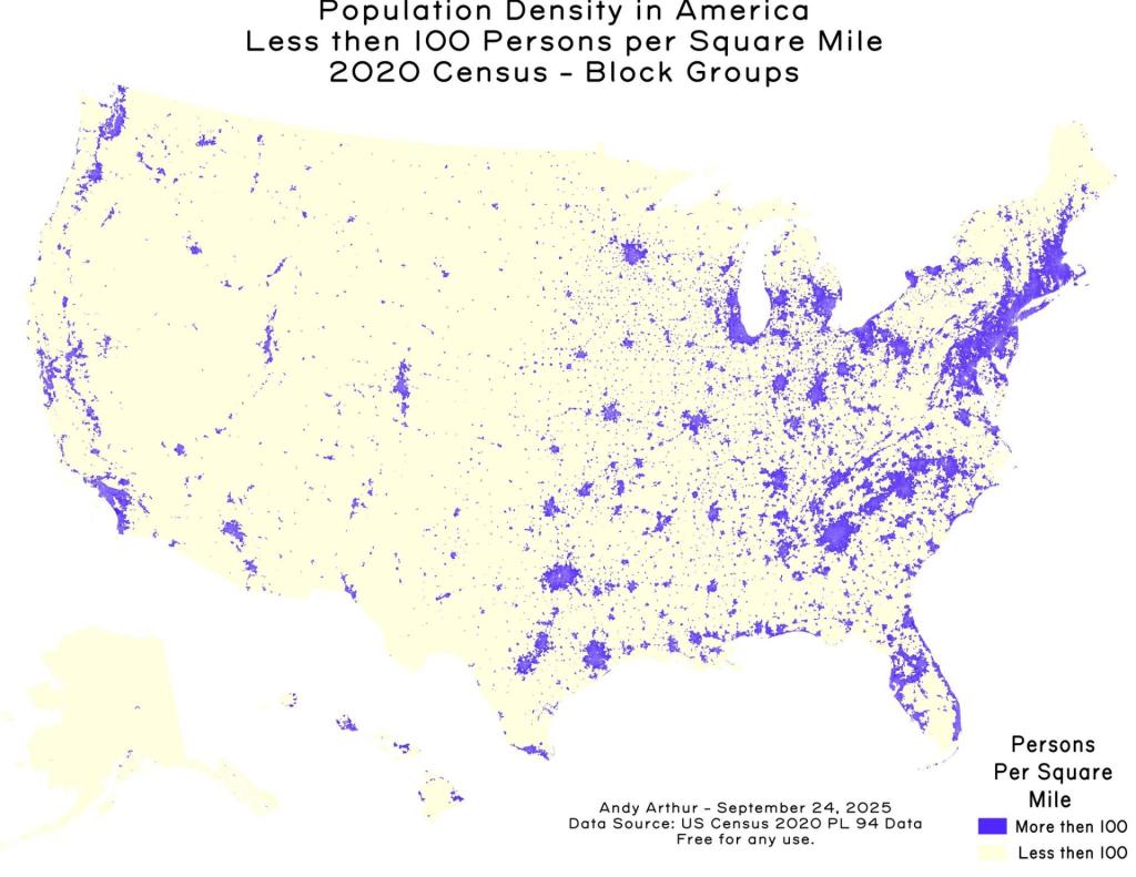
SVGZ Graphic: Counties with fewer then 100 people per sq mile
SVGZ Graphic: Domestic Migration, June 2020 to 2022
SVGZ Graphic: Half of All Americans Live Within 79 MIles of the Ocean
SVGZ Graphic: Highest Population Density Counties in Each State
SVGZ Graphic: Hispanic Population in Texas
SVGZ Graphic: How Asians Voted in NYS in 2020
SVGZ Graphic: How Many People Reside in Each Time Zone
SVGZ Graphic: Kentucky - 2020 Population
SVGZ Graphic: Land Area of States
SVGZ Graphic: Median Age by State
SVGZ Graphic: Median Household Income in Michigan
SVGZ Graphic: Median Household Income, NY and Surrounding States
SVGZ Graphic: Median Income by State
SVGZ Graphic: Median Income Distribution by State
SVGZ Graphic: Median Value of Owner Occupied Homes
SVGZ Graphic: Most Similiar Income Distributions to New York
SVGZ Graphic: Most White Counties in America
SVGZ Graphic: New York State 1790 Census
SVGZ Graphic: Ohio US Senate GOP Primary
SVGZ Graphic: Percent Male - US Congressional District
SVGZ Graphic: Percent of America's Population by State
SVGZ Graphic: Percentage of Irish Residents per State
SVGZ Graphic: Percentage of the Population that Was Born In-State
SVGZ Graphic: Population Born Out of State
SVGZ Graphic: Population Change by State, 2020 to 2022
SVGZ Graphic: Population Density in Texas
SVGZ Graphic: Population of State Capital Metro Regions
SVGZ Graphic: Population Reporting Somalian Ancestry
SVGZ Graphic: State Population Change, 2020-2025
SVGZ Graphic: Texas County Population
SVGZ Graphic: The Rich Men North of Richmond (Median Household Income)
SVGZ Graphic: Where New York State Residents Moved To in 2015-20
Thematic Map: 2020 County Population Dot Density
Thematic Map: Albany Population Density
Thematic Map: BOCES Districts
Thematic Map: Census Blocks With More then 100 People Per Square Mile
Thematic Map: Census Tracts in America with Fewer then 100 People Per Square Mile
Thematic Map: County Population Under 25k
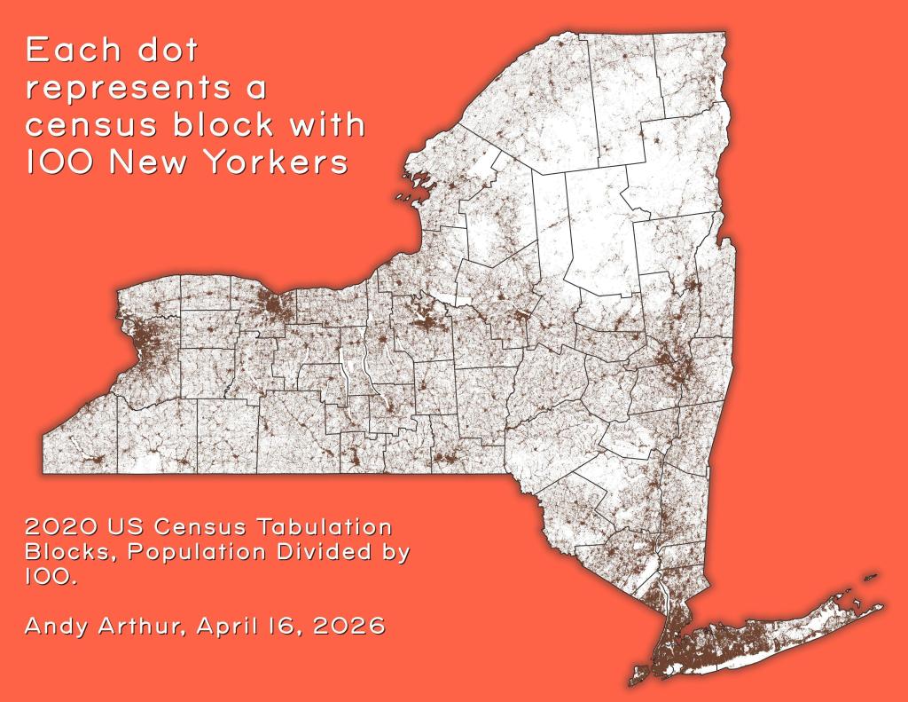
Thematic Map: Each dot represents a census block with 100 New Yorkers
Thematic Map: Households Making Less then $100,000/yr in 2023
Thematic Map: Households Making Less then $50,000 in Each State
Thematic Map: Metro Areas in New York
Thematic Map: NY Population Change 1970 to 2022
Thematic Map: Untitled
Thematic Map: US Median Household Income by Census Tract
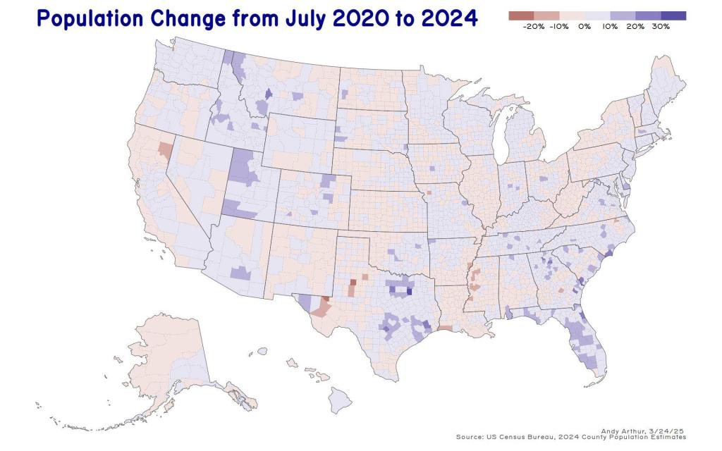
Thematic Map: US Population Change - 2020 to 2024
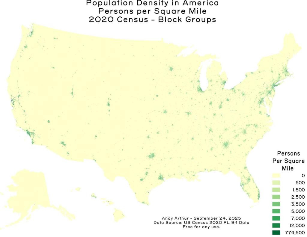
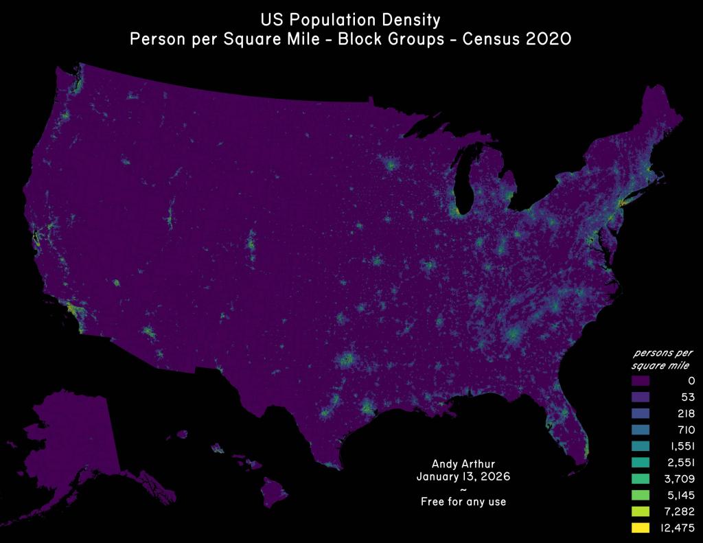
Thematic Map: US Population Density
Thematic Map: US Population Non Contiguous Cartogram
Thematic Map: us-state-pop-density-1900

Leave a Reply

Your email address will not be published. Required fields are marked *